When crafting labels for an art gallery, it’s crucial to take into account the following guidelines. Avoid overloading the label with excessive information, as this could overwhelm visitors. Aim to maintain a word count of approximately 120 words per label, as this will facilitate the creation of more engaging labels. Additionally, remember to incorporate bibliographic citations and footnotes for added context and credibility. By adhering to these recommendations, you can produce labels that are ideally suited for your art gallery’s exhibits!
Key Elements of Gallery Label Information
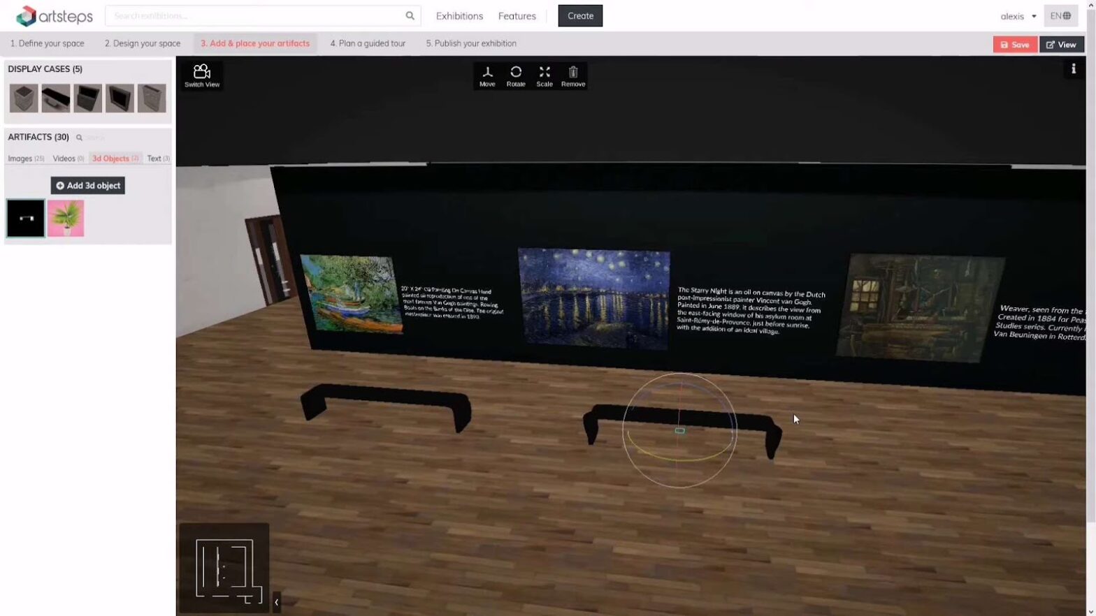
When composing the information for a gallery label, it’s important to recognize that merely listing the work’s title, medium, and price is insufficient. An effective art gallery label should encompass more than just the title. For instance, it should feature a concise narrative description of the artwork and provide a link to its online counterpart. While interactive prompts can be incorporated, they should not overshadow other essential label information.
When crafting a label for an art gallery, consider that visitors might possess prior knowledge of the artist’s oeuvre. Therefore, your writing should be concise and meaningful. It’s also essential to offer context for the art, emphasizing key aspects of the artwork and narrating the story behind it. Ideally, a label should consist of around 70 to 80 words but can stretch up to one hundred and twenty if needed. Once approved by the gallery, the label should find its place in the gallery’s catalogue.
Optimal Label Size Choices for Art Galleries
When determining the size of your art gallery labels, start by choosing the type of paper you’d like to use. You have the option of card stock or paper, but keep in mind that card stock can pose challenges with home printers.
- Opt for 105GSM paper (28lb bond) as it’s substantial enough for inkjet printers;
- For example, an A4 label would measure 8-1/4″ x 11-3/4″.
Ensure that the physical layout of your art gallery label remains uncluttered.
- A one-inch border on all sides is a good rule of thumb;
- Three-by-five inches is a suitable size for most labels;
- Avoid using font sizes smaller than 12pt, and prefer sans-serif fonts for better legibility on signage;
- For effective contrast, consider a black-on-white label;
- Furthermore, steer clear of fonts that may be too diminutive for your art gallery’s context.
The fundamental information on an art gallery label includes the artist’s name and birth year. Depending on the artwork, you may want to include additional details like medium and technique. Artwork titles often incorporate the creation year, though in one-person exhibitions, the artist’s name might take precedence. If the title surpasses the artist’s name in size, place it before the name. Aim for an 18-point font size for the art gallery label, though larger type sizes are preferable for headings and body text.
Object labels should be larger than a typical book, with fonts sizable enough to read from a considerable distance. They typically provide more concise information compared to contemporary examples. In online galleries, consider employing a large introductory label to aid visitors in locating related works by title or institution. This introductory label should be easily readable from the audience’s perspective and appropriately sized to ensure readability, ideally placed near the artwork.
Strategic Label Placement for Artworks
The placement of labels on artworks within an art gallery is a critical consideration that significantly impacts visitors’ experiences. Properly positioning these labels can enhance the overall appreciation of the art on display.
- First and foremost, labels should ideally be positioned at eye level or in close proximity to it. This placement ensures that visitors can easily read and engage with the accompanying information without straining their necks or bending down;
- Another crucial factor to consider is the side of the artwork that visitors approach first. Labels should be strategically placed on the side that is most likely to be the initial point of interaction. This intuitive placement ensures that viewers can seamlessly access relevant details about the artwork as soon as they encounter it;
- For smaller labels affixed directly to the artwork, using Bluetac can be a practical method to ensure they stay in place without damaging the piece. However, when dealing with heavier labels, it’s advisable to employ double-sided Velcro tape for attachment. While this method is secure, be cautious when removing such labels, as they can leave marks on the walls if not handled with care.
Crafting Accurate Footnotes and Bibliographic Citations
In the realm of academic and scholarly writing, the inclusion of accurate footnotes and bibliographic citations is paramount. These elements serve not only as a testament to your research but also as a valuable resource for readers seeking to delve deeper into the sources you’ve referenced.

When crafting footnotes and bibliographic citations for your text, it’s essential to mirror the information from the original source. For instance, if you’re documenting an exhibition held at a museum, ensure that your citation encompasses the following key details: the exhibition’s title, the name of the editor (if applicable), the year, and the museum’s address. Additionally, don’t overlook the importance of including the names of the artists and any other pertinent details about the artwork.
These meticulous citations and footnotes not only lend credibility to your work but also facilitate cross-referencing and further exploration for your readers. They provide a roadmap to the rich tapestry of sources and references that have informed your text, allowing others to verify your claims, delve into related research, and gain a deeper understanding of your subject matter.
Conclusion
Mastering the art of labeling artworks in a gallery involves a delicate balance of clarity, conciseness, and strategic placement. These best practices guide you through the intricacies of creating engaging labels that enrich visitors’ experiences. Remember, less is often more when it comes to labeling content, with around 120 words as an ideal limit. Optimal label size choices, font considerations, and strategic placement further enhance the impact of your labels. Additionally, in scholarly contexts, the meticulous crafting of footnotes and bibliographic citations is essential, providing not only credibility but also a pathway for others to explore your research fully. By following these comprehensive guidelines, you can elevate your gallery’s presentation and contribute to a more immersive and informative art experience for all. You may also interested in a guide on how to create a gallery in the house here.
